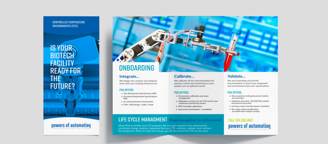
As a professional business owner you have perhaps noticed business flyer designs that caught your eye and grabbed your attention. And you may have wondered, “how can I create a business flyer for my business that would do the same thing?”
There is an art to business flyer design. Those eye-catching flyers don’t just appear overnight to help you market your business. This blog offers you a collection of best tips, culled through years of experience, to help you design the best professional business flyer you have ever created.
Make it Functional First
Although you want your flyer to pop and draw people’s attention, it is vital to first think through why you are creating the flyer in the first place.
- What information must be communicated to the reader?
- What essential information will be communicated?
- What will make this a great business flyer?
If your awesome professional business flyer doesn’t contain the vital information readers need it will not work well no matter how great it looks. Therefore keep these ideas in mind first:
Your information must be clear and concise
Limit your text to essential information only. Most people will only glance at your flyer and make a judgement about whether they will take it/keep it. So edit your content to the bare necessities.
All Print should be easy to read
Identifying a bold and clear header that pops out on the flyer is one of the most important aspects of a great flyer. Use large and clearly legible fonts for all information.
Clearly display your contact information
Use a bright bold color for your website address and ensure that vital information like the date and time of an event or sale is in big bold print.
Use Quality Photographs to Feature Products
When you include images with any text on your products the visual representation will help your flyer sell your product.
Classic design is classy
Although there is no one right way to design a flyer, when designing for business purposes it is always cool to stay classic. Keeping things clean, simple, black/white/gray with splashes of color, and using easy to read fonts remains professional classy. The eye likes to see some white space, likes simplicity and coolness. Clearly defined use of infographics and good organization helps to calm the reader.
Apply an Irregular grid
If you want or need to make the most with minimal print space it is really effective to divide your flyer into irregular sections. Mapping out a grid that maintains a bold header but opens up interesting spaces for informational content that is clear, concise and well organized helps present a lot of information in an aesthetically pleasing and comprehensible manner.
Be Bold
While maintaining a classic format your flyer can also employ the attention-grabbing trio of striking photos, bright color, and bold lettering. The use of bold colors can be especially effective at catching the attention of prospective clients/buyers. These colors can be explosively presented to really grab people’s attention or they can be sophisticatedly added to classic black & white designs to add emphasis or pizzazz in just the right places.
Photos, color and bold letters should create a positive impression on the viewer. Careful design and placement of these elements will also communicate a sense of optimism and fun to your flyer.
Include Technology
It is almost a necessity in today’s marketplace to include app-inspired design elements and QR codes to your flyers. Phones are now the major provider of information and entertainment especially to young people today. Taking design cues from app designs can improve your appeal to and connection with younger generations. Providing QR codes and website addresses so that readers can easily take action on whatever your flyer is advertising is essential. Whether that means they go to your website, sign up for an offer, get more information, etc., they will create further interest in your products and trust in your business.
Communicate warmth and approachability
People want to feel that your business is authentic and real. Including real-life photographs of employees informally engaged in the services you provide or using the products you are selling is an effective way of communicating that warm approachable feeling. Professional photographs of your staff are the best way to go because they are so authentic and can be used for many purposes. But whether you hire a professional photographer or go for stock images, make sure any people pictured are smiling and look friendly and relaxed.
Like Shrek and onions, use layers to good effect
Business flyer designs have so many possibilities these days. Information boxes can be overlaid with transparencies, different gradients can be implemented with your photographs that provide exciting and creative options for design layout, informational content and impactful photography and images.
Apply shape tools for a modular effect
Shape based layouts are an exciting tool for showcasing multiple images, products or services. The shapes create a sense of dynamism and interest while opening spaces for select images. Take advantage of these shape tools in using circles, squares, diamonds and other window spaces for vibrant photo displays.
Brighten or subdue the mood with color
Color is one of the first things people notice in flyers and brochures. Your use of it will either be a draw or a turnoff. The right combination of color will enable you to portray just the right mood with your flyer. You can communicate bright and flashy or you can cool things down just by working with your color palette. Combining black and white photography with subtle touches of your brand colors is very clean, cool and professional looking. While bright yellows and oranges will spice and warm up any white page with black script.
Create a Flyer that people will keep
If you use these tips on how to create a professional business flyer, then your flyers will be ones that people take home with them. And in so doing you will create heightened long-term interest in and sales for your business. If you think of your flyers as cheap throw away ads then that is what they will be. But if you go the extra mile to create and design artful and pleasing flyers and brochures that ooze quality, pizzazz and creativity, then your flyers will find their way into the hands and offices of potential clients who will be excited to explore their options for business with you.
Final Thoughts
Your business flyer design needs to be aligned with your brand and your business. This process is doable, but it is demanding of time and energy. Here at zo agency we work to build long term relationships with our clients. We call it Tribe!
We will work diligently to discover your vision, your passion, your needs, your hope and dreams for your business and then will create an overall marketing plan or any specific part of your plan to meet your needs and fits your budget. Visit us today at www.zo.agency

